Mastering malachite illustration requires understanding its distinctive green banding patterns and natural formations. Focus on replicating mineralogical textures through layered shading techniques—this approach makes drawings instantly recognizable as actual malachite rather than generic green stones.
Picture yourself browsing mineral specimens in a gem shop—your eyes catch those mesmerizing green swirls and concentric rings. But when your hand reaches for a sketchbook, confusion hits. "How deep should dark bands go?" "Do these patterns follow any rules?" Across art communities and tutorials, you may hear oversimplified advice like "just draw wavy green lines" or see depictions lacking mineralogical authenticity. These fragmented approaches leave artists struggling to capture malachite's essence. This guide examines seven core concepts distinguishing convincing mineral art from generic drawings, translating geology into practical techniques using verifiable characteristics that anyone can observe.
Imagine unpacking a mineral sample ordered online—you expect vibrant greens but encounter surprising irregularities. Many assume malachite follows predictable symmetrical patterns like tree rings, often because polished specimens show consistent bands. In reality, the stone’s name itself ("malache" meaning mallow in Greek) references its variable leaf-green hues rather than predictable formations. This leads artists into false expectations of uniform shapes.
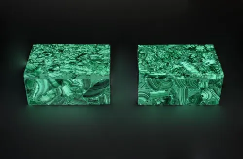
The clearer way to see it is: malachite forms through dynamic mineralization processes in copper-rich solutions. The technical_features reveal it typically grows in botryoidal (grape-like) masses where band widths can range from paper-thin layers to several millimeter-thick deposits. When drawing, note how bands may curve asymmetrically around geological irregularities—a crucial distinction from artificially perfect patterns.
Next time you sketch, try this: examine reference photos showing both polished and raw specimens. Place dots mapping band junctions instead of drawing continuous lines first. Notice junctions aren't evenly spaced—some clusters merge while others branch unexpectedly. This "connect-the-dots" approach captures organic formations better than symmetrical guidelines.
A friend once complained their malachite sketch resembled plastic—too uniformly green and unnaturally smooth. This happens when artists miss that malachite is fundamentally a copper carbonate hydroxide mineral. Many assume green hues stay consistent, not realizing how physical properties influence appearance. Technical_features show its Mohs hardness ranges between 3.5–4, making it softer than quartz but harder than gypsum—a detail impacting texture rendering.
In reality, the mineral's composition creates varied visual effects. Fibrous structures may present silky luster, while crystalline formations can exhibit vitreous reflections. When drawing, pay attention to surface fragmentation areas where radial fractures tend to occur from point impacts—these subtle flaws add authenticity.
To test your approach: use varied pencil pressures for different hardness impressions. Press lightly for areas that would naturally wear down (creating matte surfaces) and firmly for durable crystalline sections. This mimics composition differences without color changes.
Where band patterns converge, apply cross-hatching indicating softer mineral composition compared to long smooth strokes for hardened layers.
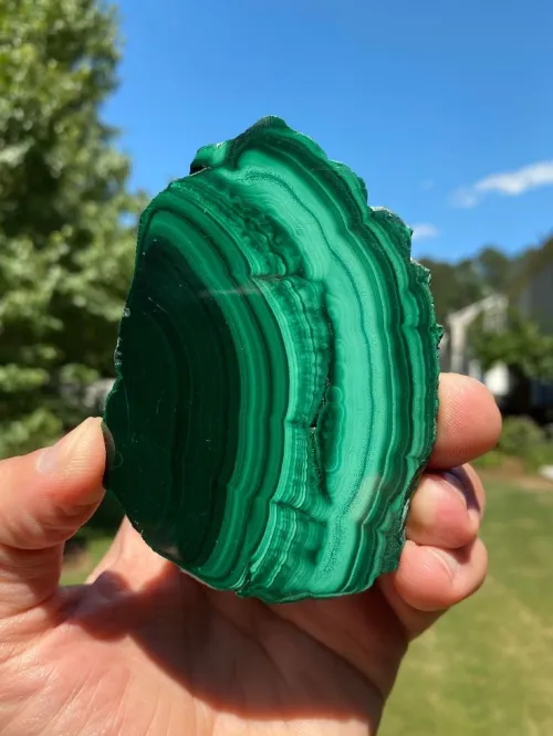
Picture this: two museum-goers debating whether a specimen displays emerald or forest green. Such confusion stems from assumptions about "standard" malachite coloring. The mineral's signature concentric banding contains far more complexity—technical_features confirm natural variations including turquoise, deep forest, and bright emerald bands coexisting in one specimen.
Technically speaking, band transitions occur through differential copper precipitation. Unlike artificial gradients, authentic malachite shows abrupt yet irregular hue shifts between rings. Some artists misinterpret this as "stripes," creating unnatural sharp edges rather than blended mineralization.
For practical verification: limit your palette to three key greens—light, medium, and dark. As bands curve away from light, blend colors progressively rather than changing abruptly. Notice where darker bands contain flecks of lighter minerals, indicating natural sedimentation patterns.
Consider how your favorite jewelry piece formed—layer by layer over millennia. Malachite’s patterns directly reflect chemical precipitation in copper-rich solutions. Some tutorials suggest copying patterns randomly, but reality follows geological logic where band thickness corresponds to mineral saturation levels during formation.
The evidence shows how concentric rings develop sequentially—not simultaneously—with newer layers conforming to existing contours. This creates imperfect overlaps where bands may appear pinched or stretched over protrusions. Depicting this helps avoid unnaturally parallel layers.
When drawing botryoidal masses: start with core shapes first. Envision water droplet paths down existing formations—new layers build wherever solutions pool most. Darker bands can mark seasonal mineral concentration shifts, not necessarily shadow effects.
Imagine visiting a lapidary shop—light plays differently on sliced versus polished malachite. Untrained eyes might assume shine relates solely to polish quality. Technical_features clarify varying luster comes from underlying structures: fibrous formations typically give a silky sheen, while crystalline structures create glassy reflections.
In practice, light interacts differently with surface textures. Rough natural aggregates scatter light, requiring stippling or speckling techniques, whereas smooth surfaces need precise highlight placement. Translucency tendencies—semi-transparent at thin edges versus opaque at thick bands—further affect luminosity.
How to diagnose your work: identify texture types before shading. For fibrous sections, apply soft parallel strokes following imagined strands. For crystalline zones, create small angular facets catching light. This replicates physical properties more accurately than generic "shine."
A sketching group might argue whether banded shading flows light-to-dark or dark-to-light. Observation resolves this: since newer layers overlay older ones, the shallowest bands often catch most light. Technical_features confirm depth perception relies on accurately portraying overlapping relationships.
Use layered approaches: begin with lighter green base washes for upper bands, adding progressive darker layers beneath to simulate depth. Where bands wrap curved surfaces, modify shading angles based on imagined light source position—not default top-left lighting.
For validation: photograph your drawing from extreme angles. If depth perception remains consistent regardless of viewpoint, your overlap techniques are working. If not, reassess how underlying layers connect to surface contours.
Recall an art shop conversation about pigments fading—this matters profoundly for malachite greens. Some "vibrant" pencils may shift toward blue over time, altering the mineral’s characteristically warm undertones. Medium selection impacts achievable results: watercolor creates organic blends resembling raw specimens, while colored pencils allow precision for polished stones.
When choosing materials, prioritize lightfastness ratings to maintain authentic copper-carbonate greens long-term. Consider scale—small specimens need tighter band spacing than panoramic formations. Balance technical accuracy with artistic interpretation.
Test medium suitability by practicing layered blending. If pigments muddy after three glazes, experiment with different brands. Achievable detail levels should correspond to your reference scale—micro-specimens require finer tools than decorative boulders.
Picture critiquing classmates’ drawings—many share identical problems like band uniformity or oversaturated greens. These misunderstandings occur because most references show isolated sections without geological context. Technical_features identify key issues: unnaturally even band spacing, solid color application ignoring natural variations, and flat rendering of dimensional forms.
Practical solutions involve deliberate "flaws": vary line thickness to reflect sedimentation rates and add subtle imperfections where bands thin abruptly. Translucency at edges can be shown with diluted pigments transitioning toward transparency.
During work review: flip your drawing upside down. Uniform patterns become obvious this way—band clusters should vary in density like cloud formations. Introduce natural weathering signs where surfaces would wear thin.
Walking through a gem exhibit will now feel different—you'll instinctively note fracture patterns beneath polished surfaces and count band widths as potential time indicators. Keep these observational frameworks: first, identify the specimen's history (raw versus polished) to guide texture choice; second, analyze light paths across bands to determine shade transitions; finally, trace formation patterns before adding color, establishing geological credibility.
When encountering new malachite samples—whether online or in galleries—pause to identify just three key characteristics: irregular band widths, varied green intensities within single bands, and organic rather than geometric shapes. These markers instantly distinguish authentic representations from oversimplified versions, letting you capture the stone’s mineralogical essence beyond surface beauty.
Q: How noticeable should malachite's radial fractures appear in drawings?
A: Fractures tend to appear subtly between banded sections, not crossing multiple layers. Light cross-hatching where bands converge may suffice unless depicting specific impact points.
Q: Does malachite's translucency affect coloring techniques?
A: At thin edges and small specimens, translucency can cause light backscatter effects. Applying lighter values toward edges may better represent this than actual transparent washes.
Q: How important is scale when depicting band patterns?
A: Band spacing proportions remain consistent relative to specimen size. Micro-specimens may appear denser but should maintain similar irregularities as larger formations when magnified.

$